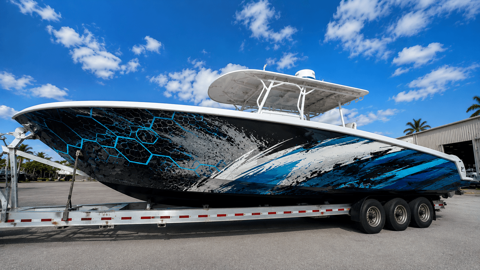
A great wrap starts with a great design. Some common mistakes can make even an expensive, well-installed wrap look disappointing. Most of them are easy to avoid if you know what to look for before approving the proof.
Text that's too small#
Text that looks perfect on a screen may be unreadable from the dock. Names, phone numbers, and websites need to be large and simple. Test sizes with a full-size paper template taped to the hull, then step back to where people will actually see it.
Too much going on#
Busy designs with many colors, effects, and small elements can look cluttered from a distance and hard to read in photos. Simple, bold designs usually have more impact. Decide what the one main message or feature is, and let everything else support it.
Graphics cut by fittings#
Logos sliced by a vent, names broken by a window, or artwork interrupted by a cleat look unplanned. Mark every fitting, window, and vent on the design template before finalizing the layout.
Clashing with fixed features#
Canvas, upholstery, bottom paint, and engine cowlings stay the same after a wrap. Colors that clash with them can look accidental. Consider the whole boat, not just the hull sides.
Backward text#
On designs mirrored for port and starboard, text can end up reversed on one side. Check both sides of every proof.
Low-resolution images#
Blurry images ruin printed designs. Our image resolution guide explains what's needed.
Forgetting required markings#
Registration numbers and other required markings must remain visible and legible. Plan space for them from the start, not after the design is finished.
Chasing short-lived trends#
Very trendy designs can look dated quickly. If you plan to keep the boat for years, consider a timeless core design with trendier accents.
Frequently asked questions#
How can I avoid design mistakes?#
Work with an experienced marine designer and check every proof carefully.
Should I get a mockup?#
Yes. See our proofs guide.
Can you review my design?#
Yes. See our custom boat wraps service.